
By Hank Nuwer
Collier’s magazine once flourished as one of the most-read publications in America.
Kurt Vonnegut fans celebrate the tale of his discovery by Collier’s fiction editor Knox Burger. Publishing a story in Collier’s encouraged Vonnegut to keep writing–even when he wallpapered his den with rejection slips from other magazines.
Esteemed for its muckraking and storytelling, Collier’s existed from 1888 until its final issue January 4, 1957.
I never minded getting haircuts as a lad. While the barber lowered my father’s ears, I devoured the last issue or two of Collier’s before my turn for the clippers.
So, I subscribed with excitement when I read that Collier’s had been exhumed as an acquisition by LNN-USA of New Jersey. LNN is a media company that serves the public with much-needed community newspapers.
More exciting, Collier’s hired an award-winning, retired Oregonian columnist named Tom Hollman, Jr., as a senior editor. Hollman never wrote a bad column in his life.
Unfortunately, the reboot put together by Collier’s CFO/ board chair Robert Capoferri and publisher/editor-in-chief Craig Richards needs a new mission and a redesign.
It now is a vanity publication and reeks of self-promotion and political propaganda.
If you are keeping score at home, Craig Richards appears in FORTY of the magazine’s EIGHTY pages.
Richards writes six major features, appears in numerous photographs, and dominates roughly half the issue.
The inside of the magazine is not a complete design mess, but looks thrown together and lacks any sign that an experienced art director is at the steering wheel.
The first issue’s editorial content no more resembles the former Collier’s magazine than a prehistoric, four-legged mammal resembles today’s Blue Whale.
The new magazine’s cover uses paper stock as glossy and thick as a gift card. Under the title’s lettering in embossed gold, comes the tag line: “Investigative, Independent, Intentionally American.”
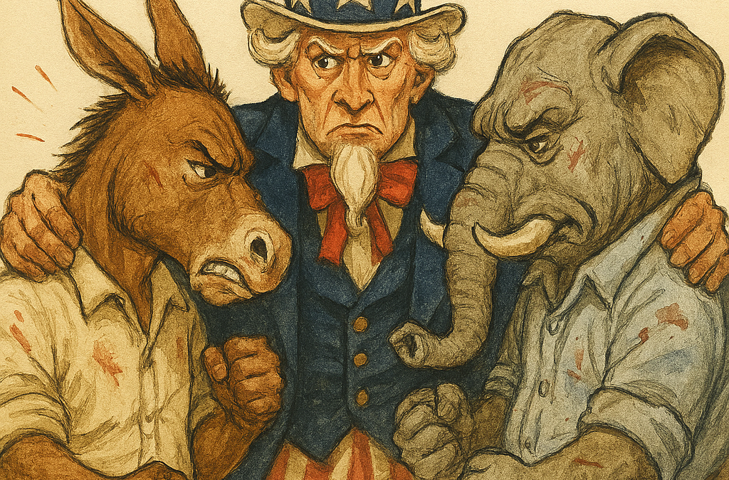
The cover illustration under the “Together we fall!” coverline depicts a perturbed Uncle Sam squeezing the necks of an enraged donkey and pissed-off elephant. Each animal has its fists balled up. However, instead of eyes full center as one would expect, Uncle Sam’s gaze is fixed squarely on the Democrat. That may be inadvertent bias.
The inside cover contains flattering portraits of Capoferri and Richards. That page boasts “a new chapter for an American icon” and promises the same platform that once hosted the work of Jack London, Upton Sinclair and Ernest Hemingway.
In addition, even before the table appears is a whole page devoted to staff & contributors. A full third of the page is devoted to the bios of Capoferri and Richards with the SAME flattering portraits of them a reader endured on the inside cover. The same portraits twice–what’s with that?
The traditional front-of-the-book section is a confusing mishmash. The first full page has a hard-to-read introduction in small type “introducing…`Surrendered Sovereignty—and the invisible war machine.”
The article starts on the next page with an amateurish black-and-white illustration of a fat-cat banker holding a sheet reading “LOAN,” Beneath him, an eagle, bear and eagle with the flags of three countries cower before Mr. Fat Cat in servitude. Did someone’s sixth-grade kid draw that?
Oh, a sixth-grade kid did draw that? You got a future, kid. Kidding!
Don’t get me wrong, I appreciate the article writer’s (Craig Richards) intent: that is, to expose “a global system of credit, debt, and financial interdependence that increasingly defines the boundaries of what governments can and cannot do.”
Again, part of the problem with that story is a lack of art direction. It’s a three-column, two-page blob of black type and long, dull subheads that subdue Richards’ message. SIMPLY PUT, IT’s not easy to read all those art-devoid pages of print.
Worse, it takes two more pages before a reader finally gets what should have been first: a table of contents. And again, the table’s layout is a mess. Beneath six photo snippets are terribly long and boring article descriptions.
Nonetheless, on a positive note, it’s good to note the magazine has secured the services of publishing professionals Hallman, Jr.; Brielle Jaekel (deputy editor), and Douglas Perry.
The question is whether Jaekel in future issues can be given a free hand to deliver the real London-Sinclair-Hemingway editorial goods as promised. This is probably my BEST suggestion. Give her the reins and watch this publication gallop!
I could go on and on about the issue’s weaknesses. That second story contains an interview with an anonymous source named Juan, identified as “husband, father, employee…illegal immigrant.” The introduction is hardly compelling, and the q-and-a with Juan goes on for ELEVEN WHOLE PAGES. Eleven—count ‘em—Eleven!
Senor Juan, however, comes across as bright, sincere and likable. With tight editing, a different photo, and superior art direction, this story could melt hearts and make a cultural statement of merit. The old Collier’s did that routinely.
The very next article by Mr. Craig Richards is a puff piece titled “The Last Moderate?” with the subhead “Joe Manchin’s Retirement and the Vanishing Center in American Politics.”
And good golly, if the gentle reader hasn’t thrown this issue of Collier’s into a flaming barbecue pit yet, the very NEXT magazine piece is a nine-page interview with former West Virginia Senator Joe Manchin.
All that black-and-white type is relieved only by a pen-and-ink drawing of Manchin.
The original Collier’s magazine would have illustrated the story with a witty caricature of Mr. Manchin by a professional caricaturist. Even better, why not have former W.V. Senator Joe Manchin WRITE a commentary?
The old Collier’s would have done that. You know who wrote for the old Collier’s? Try, for example, Winston Churchill, Upton Sinclair, H.G. Wells, and Werner Von Braun.
Craig Richards’ final article for the magazine is an annoying tribute to the Feast of Our Lady of Mt. Carmel in Hammonton, New Jersey.
It’s an article that belongs in a local, Hammonton newspaper, not in a national magazine. I’d much rather read a Kurt Vonnegut piece about “Our Lady of Perpetual Astonishment.”
What’s left to read? Some good stuff, actually. I like the well-written service article by Jaekel on overweight Americans; it’s accompanied by an effective illustration of a beer-belled man on a scale. “No sour cream on my baked potato tonight, Dear.”
There is a nice piece on Chicago journalism legend Mike Royko and his connection to the Fox River eco-saboteur Jim Phillips. Disclosure: I once interviewed Royko on the same topic but although Royko was cordial, he was pretty close-mouthed and I abandoned the story.
Then, on the plus side, there is compelling fiction by novelist Mary Ellen Walsh. Her long tale is included among several intriguing “Dispatches Across America” edited by Hollman, Jr.
Give us more of these fine fiction stylists, Mr. Editor-in-chief. Collier’s once was known for its fiction. It can be that once again.
Unfortunately, all that quality prose in that feature well gets lost in 14 pages badly lacking in illustrations. This should be the HEART of the magazine in future issues. The writing is compelling.
To sum up, the new owners of Collier’s bought the rights. Here’s hoping the second issue earns the name.
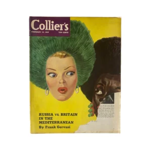
Above: Your Grandfather’s Collier’s of 1945.
Hank Nuwer has written for GQ, The Nation, The Saturday Evening Post, AARP magazines, Outside, Harper’s and a ton of city and state magazines.